Archive · 2021
STORY BY FORTUNE.COM
My Role: UX/UI, Prototyping, Design Management

When designing for Mobile Payment, I had to solve for a couple different scenarios… 1.) The user who is paying from the microsite/browser version, not the native app experience
2.) The user who is paying with the native app and already has a payment method setup.
3. The user who has the app, but doesn’t have a credit/debit card on file or NFC payment.
4.) A transaction being flat out declined (general error)
5.) A credit/debit card needing replacement due to expiration.
Below shows the most common flow, a user who does not have the app installed and is in their initial discovery phase of Sodastream Connect. This user is accessing payment via the microsite/browser.


I designed a symbol for the enhancements with a goal of maintaining simplicity to match the already existing brand nature. A noteworthy and very specific constraint was that I could not use any symbolic elements that may cross into any of Pepsi’s other brands
(Like a bolt symbol would cross into the Gatorade branding)
Below are some of my initial ideas for what the enhancements icon could look like. Ultimately the “Plus” design became the winner because it spoke to what the feature provided the user while also bringing visual balance.

After designing the symbol for drink enhancements, I had to solve for the different interactive states and how the symbol would change depending on how it is being displayed and what other visual content it was on top of, if any.

I built a few different prototypes to demonstrate different logic options for how the enhancements would be sorted. The “Push Up” logic is the final choice we ended up using. It made sense that Enhancement #2 can never take the top position because it is always on the right hand side when looking at the Toggle options are going from left to right, the same way the user reads the rest of the content on the page.

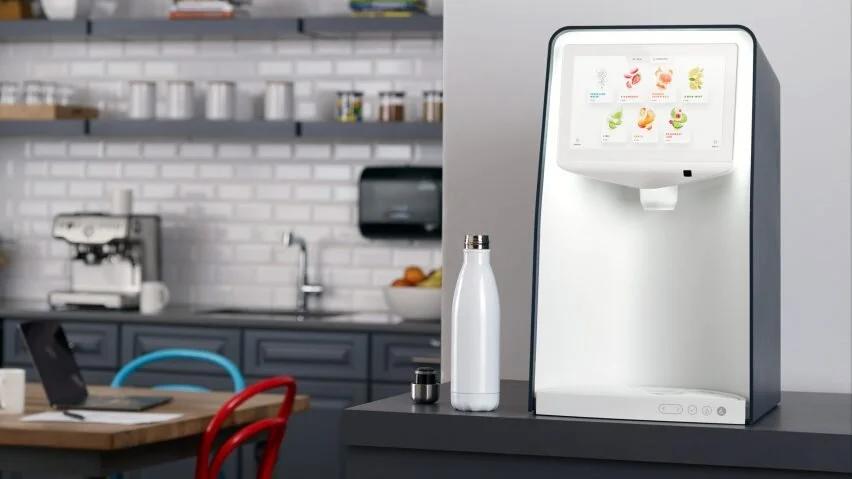
For a large part of localization, I worked to translate US English designs for both the app and dispenser to French and also UK English.
Some other things I had to consider for design discrepancies between regions were..
1.) Currency could change between USD (For the US), EU (For France), and GBP (For UK).
2. In Europe, commas are used in place of the decimal point. This change happened anywhere currency or measurements were made in the app (purchase prices and drink measurements).
3. Every country has its own FDA regulations. This meant a surprising amount of changes visually. In the United States it is not required to have a disclaimer for artificial flavoring while using real fruit imagery. This is not the case in the UK + Europe, meaning artificial flavor must always be included in the title.


Project Takeaways: 1. Communication is key - Working with such a large company like Pepsi, they are bound to have loads of requirements. Making time to really communicate what we were really trying to solve and the constraints we were working under helped to clarify what was possible for design without wasting any extra time. Every meeting we were lucky to have a requirements team to collaborate with and come up with creative plans to deliver as much as we could for a great user experience.
2. Logic informs great design - When working between drink enhancements and payment, it sometimes became difficult to communicate what actually made the most sense from the users view. In order to solve with stakeholders, I made some very quick prototypes and went through interaction by interaction where we could visually address minor nuances you might not otherwise think about. By prototyping and walking through with stakeholders, we were able to efficiently problem solve even for complex problems rather quickly, sometimes in as little as 15-20 minutes.